从土地到视觉:农业品牌如何用设计重塑“风土与美”的价值表达
在当代农产品竞争日益同质化的背景下,品牌与包装设计正在成为打破局面的关键语言。农业法人One通过一系列系统化设计,将“土地—文化—产品”重新连接,构建出具有辨识度与情感价值的品牌体系。
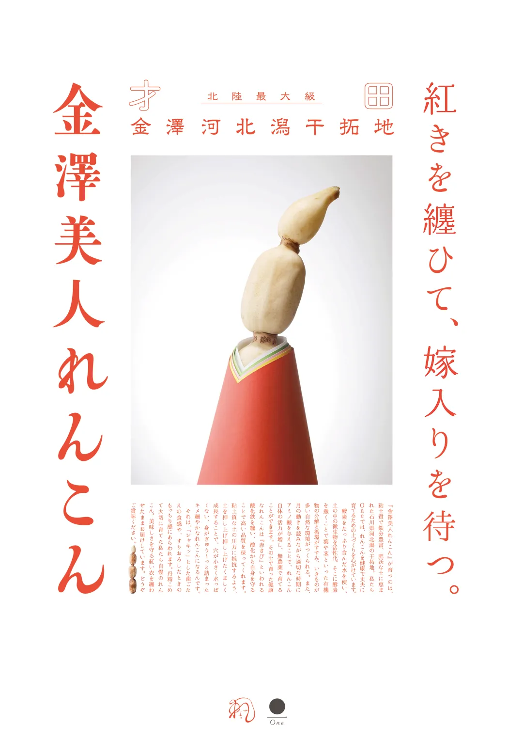
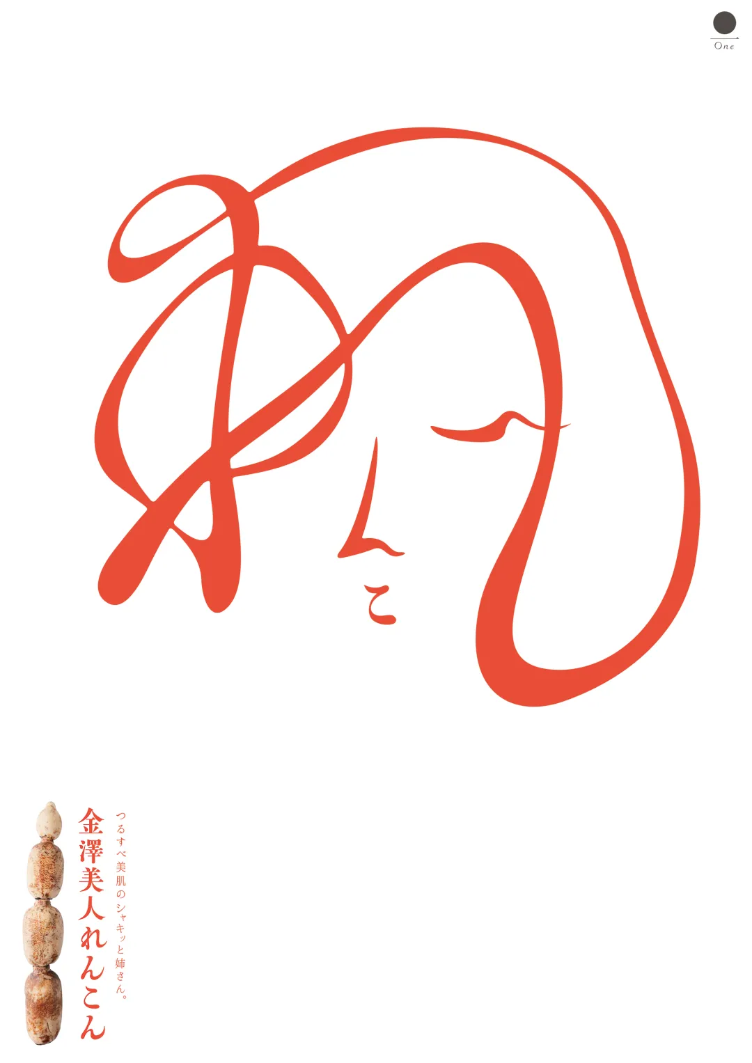
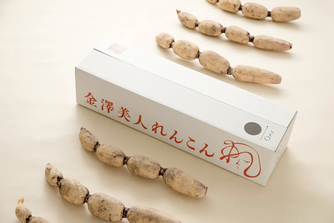
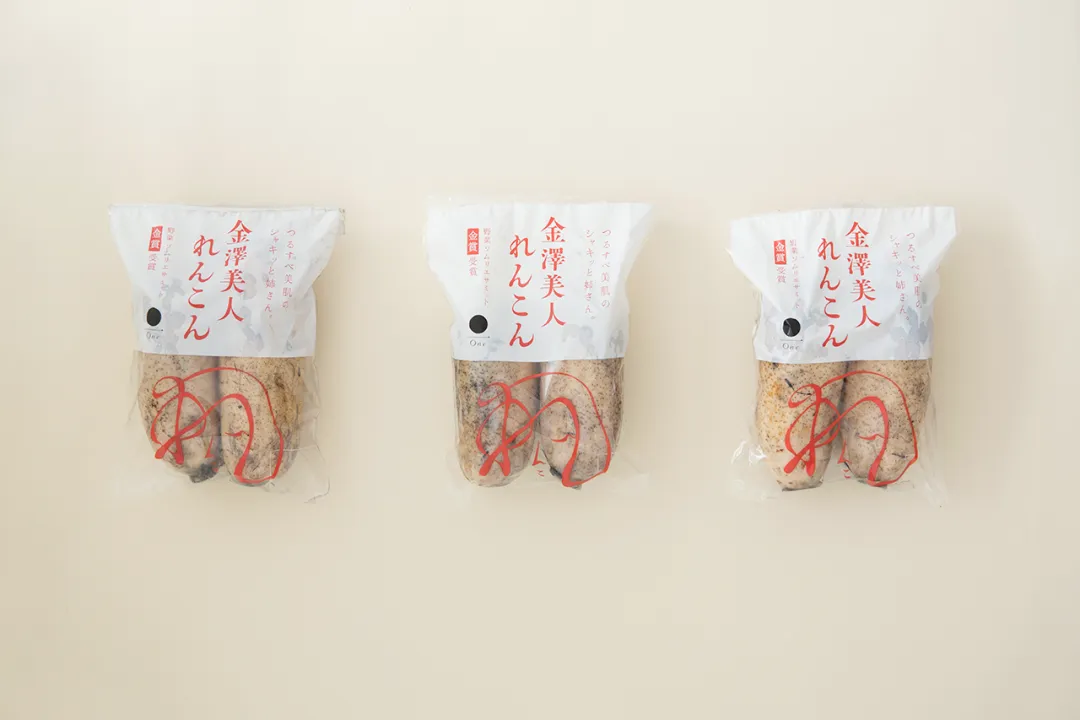
以“金泽美人莲藕”为核心产品,品牌从原料本质出发:莲藕从泥土中生长,经水洗后呈现出纯净洁白的质感,同时富含美容与健康成分。设计以极简白色为主视觉基底,辅以红色线条勾勒女性侧脸形象,将“美人”这一抽象概念具象化表达,既传递产品特性,又精准吸引年轻女性消费群体,实现审美与功能的双重沟通。
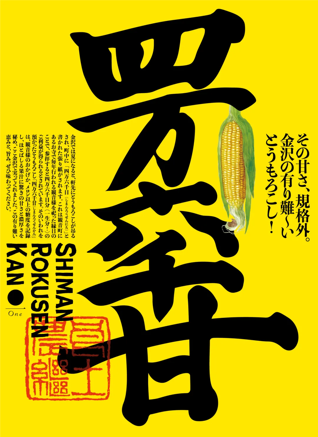
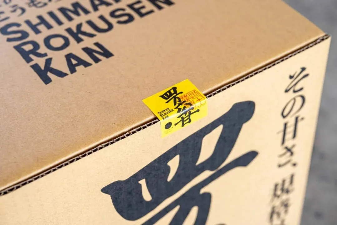
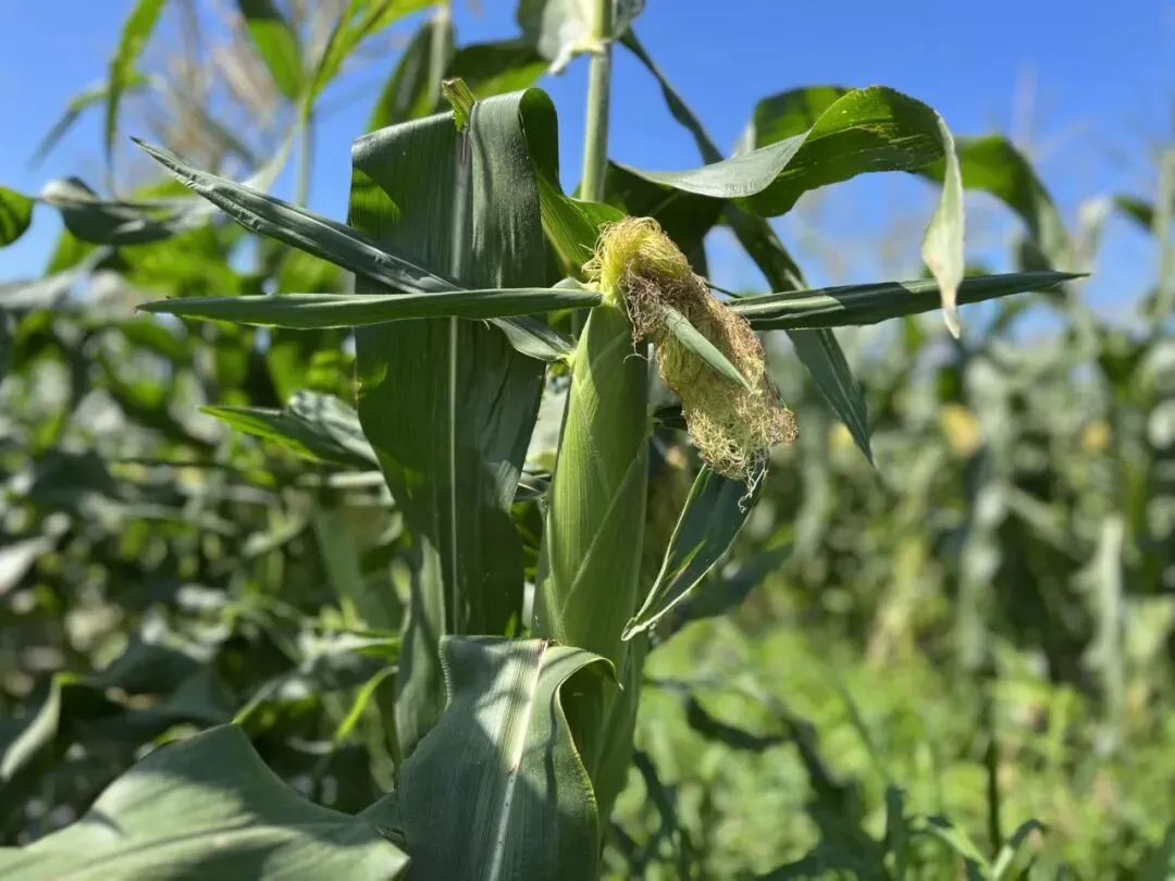
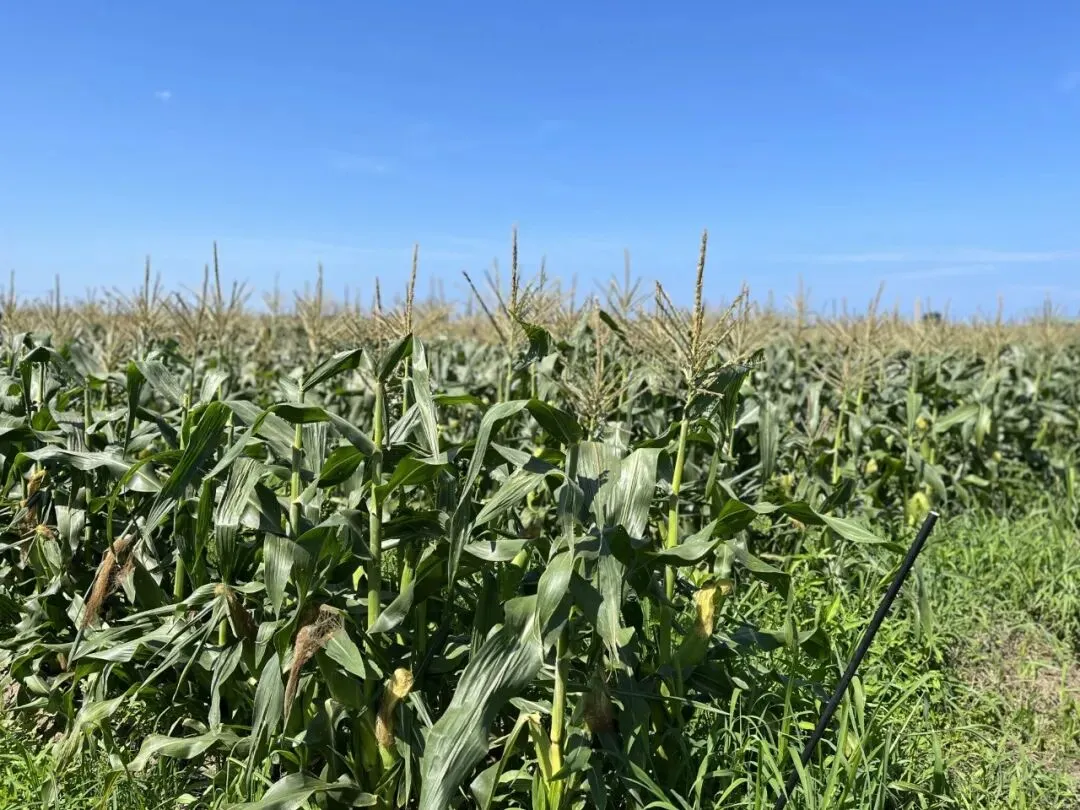
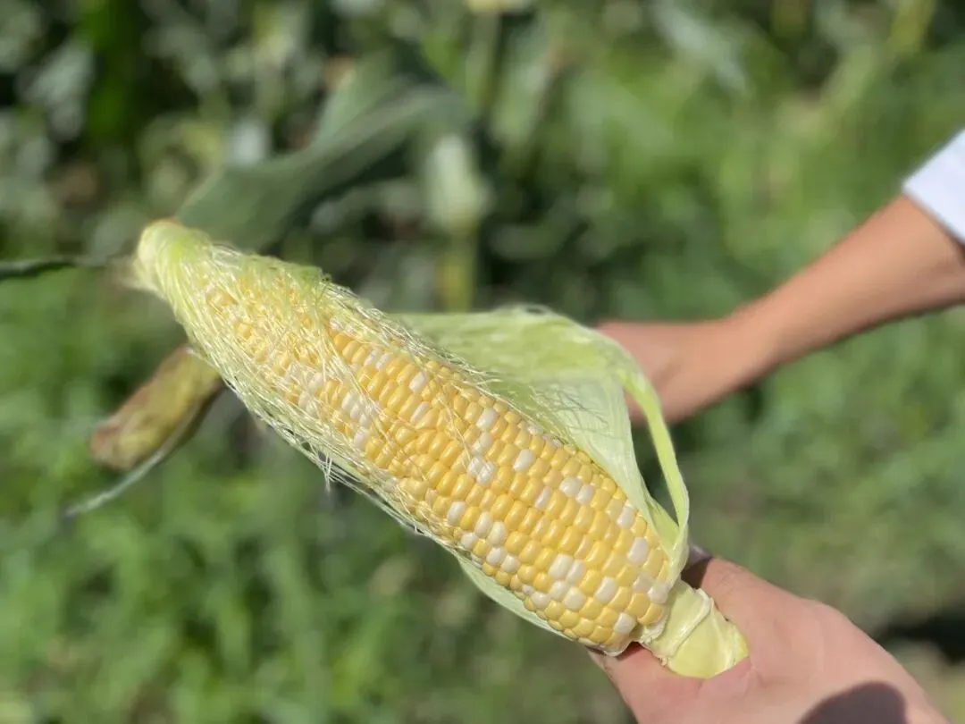
“四万六千甘”玉米则从金泽在地文化中汲取灵感。源于“四万六千日”的传统信仰,这一天被赋予成倍的福报意义。设计将这种文化转译为产品价值,通过高饱和黄色标签与书法字体,强化视觉冲击,同时保留玉米原生形态,使其既真实质朴,又具象征意义——不只是食材,更是一种承载祝福的媒介。
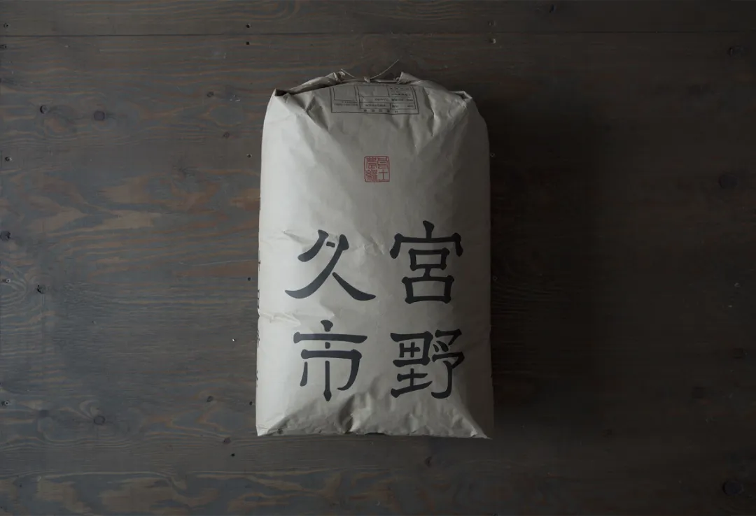
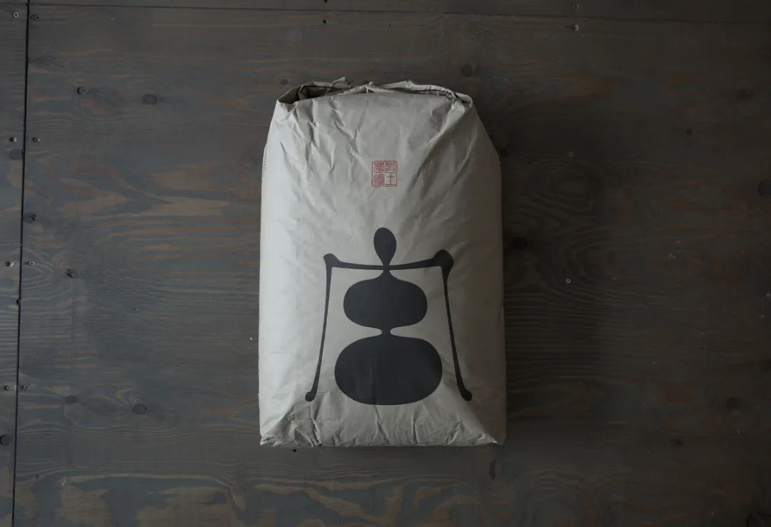
在大米产品上,设计回归品牌根源。大米作为One农业的起点,以创始人命名强化传承属性,并以“良土农继”为理念核心,将“宫”与“土”融合为极简符号,运用于牛皮纸包装之上。低调却有力量的视觉语言,传递出稳定、可信与自然的品牌气质。
从莲藕的“美”,到玉米的“福”,再到大米的“根”,One通过统一而多元的设计策略,让农产品超越功能属性,成为可以被感知、被记忆的文化体验。这正是当代农业品牌设计的真正价值所在。
From Soil to Visual Identity: How Agricultural Branding Redefines Beauty and Terroir Through Design
In today’s increasingly homogenized agricultural market, branding and packaging design have become essential tools for differentiation. One, an agricultural corporation, demonstrates how design can reconnect land, culture, and product into a cohesive and emotionally engaging brand system.
Taking the “Kanazawa Beauty Lotus Root” as a key example, the branding begins with the intrinsic qualities of the product. Grown in soil and revealed through washing, the lotus root appears pure white and is rich in beauty and health benefits. The packaging adopts a minimalist white background, paired with a red line illustration of a female profile. This visual metaphor transforms the abstract concept of “beauty” into a tangible identity, effectively appealing to younger female consumers while communicating both aesthetics and function.
The “46,000 Sweet Corn” draws inspiration from Kanazawa’s local cultural tradition known as “46,000 Days,” a belief that visiting a shrine on a specific day brings multiplied blessings. This cultural narrative is translated into product design through bold yellow labels and expressive calligraphy. Combined with the natural form of the corn itself, the design balances authenticity with symbolism—positioning the product not just as food, but as a carrier of good fortune.
For the rice product, the design returns to the origin of the brand. As the foundation of One’s agricultural heritage, the rice is named after the founder, reinforcing a sense of legacy. Rooted in the philosophy of “good soil cultivation,” the logo integrates the characters for “Miya” and “soil” into a minimal symbol. Applied to kraft paper packaging, the design conveys a sense of reliability, timelessness, and natural integrity.
From the “beauty” of lotus root, to the “blessing” of corn, and the “origin” of rice, One uses a unified yet diverse design strategy to elevate agricultural products beyond their functional value. Through design, these products become cultural experiences—tangible, memorable, and emotionally resonant. This is where the true value of contemporary agricultural branding lies.
创作交流wei xin:cylobo

 10个月宝宝每天需要喝多少奶粉?
